Monday 18 May 2015

COP2 Module Evaluation

General Thoughts

I have really enjoyed COP this year, it’s been my favourite module on the course so far. I feel like the majority of the lectures this year have been much more beneficial to me. I found The Gaze and The Media, Consumerism, and Globalisation lectures particularly interesting. Given the focus of my essay, I’m sure I would’ve thought I’d have enjoyed the lecture on ethics, but unfortunately I was ill for that one.

The study tasks we’ve been set were really beneficial, the identity theory task really helped me look at things critically, which was something I struggled to do beforehand, and the triangulation exercise forced me to write in a way that triangulates an argument, which is something I’ve been doing innately in my essay since this.

My Performance

Looking back on my module evaluation from last years COP, the things I needed to improve on were commitment, attitude, and time management, and I think that I have improved massively in all three of these senses. I particularly think my attitude in COP has been pretty unquestionable, which is something that I’m really pleased about given my generally poor attitude to the course as a whole last year.

Making an early start on my essay has really benefitted me, because whenever I’ve spoken to Richard or Simon about it, I’ve had different questions to ask, which has resulted in a large amount of feedback. This has really helped the quality of my essay compared to last year. My approach to research has been a lot better this year as well, I found that taking out a couple of books led me to other books, and then it was easy to target areas of research that I didn’t have much content. This ultimately led me to discover Nietzsche, and although I haven’t used his ideas very much this year in COP, I want to base my dissertation around him next year.

Next Year

I’m really looking forward to writing my dissertation next year because it’s about a subject that I’m genuinely interested in. Towards the end of my essay this year I found that I was struggling to say everything I wanted to say in under 3,300 words, and so having the limit upped to 9,000 should give me much more room to enjoy my writing. 

Over the past two years my practical work in COP hasn’t been as good as I would’ve liked, and I hope that the slightly different approach to practical work in COP next year will help remedy this, as doing it throughout the year will mean that I’m constantly thinking about it in the same way that I’ve been constantly thinking about OUGD505 since Christmas.

Friday 15 May 2015

Practical Response Evaluation

What Went Well


My solutions definitely had the right tone of voice about them, which was the main thing given I was trying to produce work with a positive feeling behind it.

I’m also pretty pleased with the process I went through to get to the outcomes, as the reseach was pretty concise which meant that I didn’t spend more time than neccdssary and my influences were clear.

What I'd Change

I realise now that after changing my initial WWF proposal I didn’t end up doing any first hand research before producing the outcomes, only retrespective questioning as to the success of my outcomes, which, even then, was a bit flimsy.

On thies topic I’m very annoyed that I didn’t end up taking my WWF posters to Yorkshire Wildlife Park with me to get opinions on them. This didn’t happen because it was raining slightly on the day my housemates and I had planned to go, so the few people that were there weren’t in the best of moods, so I probably would’ve got skewed feedback anyway.

The production of the Beer Pong cups was very rushed, and I think this is shown in the inconsistencies between them and the clear use of double-sided tape and white tack from looking inside the cups. That said, these imperfections help remove the seriousness from politics, and the more homemade feel to it adds a fun undertone to the project.

General Comments

Whilst I’m not particularly pleased with the visual look of the outcomes I produced, I’m very happy with the concepts behind them and I feel they prove what I set out to prove.

I found producing the practical work much easier this year than last year, and I put this down to having an essay to base it one that I had an interest in.

Thursday 14 May 2015

Political Beer Pong Production

Below are the beer pong sets I made for my COP practical work


Influences From Research
  • The response "less text makes me think more" from my first hand research made me limit the amount of policies I put on each cup to three, which means that people don't have to read lots and are left with some brain capacity to think about the policies shown rather than struggling to remember a saturated.
  • Using numbers and statistics were possible was something that my first hand research suggested was convincing/assuring, so I added them to some of the policies where appropriate.
  • The whole project was based around the recontextualisation of politics, in the same way the political Pokemon cards achieved it.

Relevance To My Essay

“In the modern world the freedom of the individual is all-important. We don’t like being told what to do and question the right of those passing judgment. Conversely, we want to live our lives with a good conscience and so look for mechanisms to facilitate this taking place.” 
Roberts (2006)

"We have been bombarded with publications devoted to this belief, applauding the work of those who have flogged their skill and imagination to sell such things as: cat food, stomach powders, detergent, hair restorer, striped toothpaste, aftershave lotion, beforeshave lotion, slimming diets, fattening diets, deodorants, fizzy water, cigarettes, roll-ons, pull-ons and slip-ons. By far the greatest effort of those working in the advertising industry are wasted on these trivial purposes, which contribute little or nothing to our national prosperity."
Garland (1964) 

Design Decisions

Colours

I started out using the traditional red and blue American frat-party style plastic cups to try and make the connotations of alcohol and social interaction as clear as possible in the hope that they would overrun the boring connotations of politics. I tried to stick to these sort of vivid colours when trying to represent parties other than Labour and the Conservatives.

Fonts

I chose to use Gotham for the text because of the successful political connotations with it from Barack Obama’s Hope campaign, as well as it being a popular font on the internet, which sits well with a younger audience.

Layout

The idea was to keep the cups simple so as not to detract any attention from the policies written on them or the faces of the party leaders. For this reason there is no extra text, not even naming the party the cup is representing, as this is represented well enough through the photographs and colours.

Tuesday 12 May 2015

Political Beer Pong Proposal and Rationale

Rational

Since doing Study Task 4 in OUGD505 I realised how uninformed students are on the subject of politics, and was surprised by how few people planned on voting in the general election. I was initially planning on re-designing this Operation Black Vote campaign for the reasons explained in that post, but after doing the study task I felt that this was a more relatable issue.

It's still a relevant issue to the essay question as the campaign the government ran on getting people to get people to register was based on fear (as shown below) albeit in a slightly satirical manner.


While the government has clearly made an attempt to try and remove the seriousness from politics and make it a bit more fun, it doesn't go far enough to really have some weight behind it. Not only this, but it doesn't provide any information about any of the parties to give people an indication of who they should vote for.


After seeing how well political subversions of pokemon cards worked as shown by the amount of time I, and the people I showed them too spent reading them, I wanted to try and replicate this comedic way of presenting information in a way that would be accessible to students and distributed physically to them for free.

Proposal

In my first hand experience as a student, whenever you want a pack of cards, no-one has one, this is a basis I worked on fairly successfully in OUGD504. Cheaply making a political Beer Pong "kit" that could be given out for free in Freshers packs would provide students with something they could have fun with that subconsciously adds positive connotations of fun and sociality to politics.

The "kit" would simply be 2 lots of 6 plastic cups, each of the 6 cups would be a different colour to represent different parties, and would have a photograph of the leader of the party on the front, with some of their policies that are beneficial to students on the back.

Keeping the political content to a minimum is required to make sure it's not contradictory to the fun nature of what I'm trying to produce. Whilst playing the game people obviously wouldn't read the policies, but when it's being set up or tidied away the person doing it may take a couple of seconds to read the policies, which would then spark their curiosity to make them look into it further.

Thursday 30 April 2015

Lecture - COP3 Introduction

Things to consider for COP3:

  • Consider the aesthetic, cultural, historical , technological, social, and political contexts of your topic.
  • Try and be logical, critical, methodical, evaluative and analytical in your writing.
  • Have a range of practical, physical and theoretical research.
  • The synthesis between your essay and your practical work should start from the very beginning of the module.
  • Research what makes the subject what it is today?
  • Who are the key figures in the subject?
  • Is there a dominant ideology that informs the subject?
  • Is the subject culturally specific?
  • Why are you asking the questions you're going to ask?

Positive WWF Campaign Posters

Below are the posters I produced for WWF that try and use positivity as an encouragement to donate as an alternative to using guilt and fear.


Influences From Research

  • Using full colour avoids the ghostly, horror-film connotations of black and white mentioned in my first hand research, and is better than monotone or duotone because it removes the over-reliance of colour-based connotations.
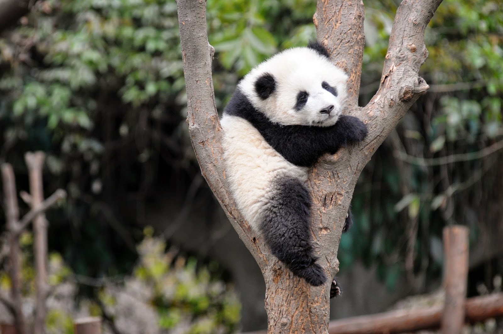
  • Using the Panda in the campaign is important as it sets the precedent for the other animals. People know that the Panda is endangered (some/most will know the rhino is endangered too), but not that the Golden Lion Tamarin Monkey is endangered. By using them in the same recognisable campaign you give the monkey the same connotations as the Panda, as discussed in my essay based on Hamish Pringle's Celebrity Sells.
  • I avoided using leading questions, because my my first hand research suggests that they were effective at making people feel guilty. Combined with innocent looking images I could have accidentally made people feel guilty by using leading questions in the same way that the text on the "Would You Care More" campaign turns it from a fun campaign to a guilt-inducing one.
  • Keeping the images as the main focus and only having small text was done because my my first hand research suggested that less text makes people think more, which makes sense given that a picture can paint a thousand words.
  • I used some statistical evidence because my first hand research suggested that they were effective at creating guilt within a campaign that was meant to create guilt. On that basis they should be effective at creating encouragement and positivity in a campaign that intends to do create these things.

Relevance To My Essay

"There are pursuits more worthy of our problem-solving skills. Unprecedented environmental, social, and cultural crises demand our attention."
Adbusters (2000)

"WWF's founders were aware of the need for a strong, recognisable symbol that would overcome all language barriers."
WWF (2015)

"A member of the audience, some research has shown, cannot be affected by the media if they do not fulfil or gratify a need. For instance, if a person leads an active, varied life, and is secure and stable, no amount of advertising which appeals to fears of loneliness or being a social outcast, or to social snobbery will succeed."
(Dyer, 1982)

"Given the power of fear to motivate and direct our thoughts, there is much potential for abuse."
(Aronson & Pratkanis 1997)

Design Decisions

Image Choices

All the photographs were chosen because the faces of the animals weren't in the centre. This gave me more room for manoeuvrability in terms of having the room to place text or any other images on top them. The panda and monkey in particular were suitable because the way the photographs are composed leave a large space at the bottom of the page that can be used without hampering the animal.

Font Choices

The font for the years is WWF Regular, WWF's custom font that is used on their website for all the titles. It's somewhat distinctive through how narrow it is and it's thin tracking. The thin tracking means that when a stroke is put around the text, the strokes sometimes meet, which aids readability as it removes the colour from any image behind it. The smaller text is Open Sans, which is the font used on WWF's website for their body copy, their was no need to change this as it is plain enough not to offer any distractions from the photographs. Using black and white keeps the text clear through the contrast with the photographs, as well as is matching the distinctive WWF logo.

Layout Choices

I chose to use 5 columns because it meant the bars would be a width that would work at big heights and small heights without making them look to fat or too thin. The WWF logo is placed in the 5th column above the highest bar to try and link it with the success of the taller bar. The bars are slightly translucent to suggest an element of frailty so as not to suggest the conservation work is finished. The longer sentences were placed on the left below the bars to try and balance the page a bit, as the the taller bars were on the right. The shorter sentence is next to the logo to link it with WWF in general rather than a specific animal.

Wednesday 29 April 2015

Political Pokemon Cards

I was sent this link by a friend the other day showing the below images.


They're based on the Pokemon trading card game (below), which was a big part of my childhood as it was many other people of my generation. There is a big drive to get young people interested in politics at the moment because of the upcoming general election, and combining humour with nostalgia like this gives politics some much needed positive connotations to people of my generation.


Because of the nostalgia I felt when looking at the political Pokemon cards, I read all the text on every card, which took between 5 and 10 minutes. I believe this shows that you don't always have to take a serious tone to engage people with a subject, an approach I took in my collaborative WWF brief for Responsive. Things like this are much more successful at engaging people that the Saatchi & Saatchi campaign for Operation Black Vote because the audience doesn't feel like they have to be so serious, this is especially important in the case of politics where an audience member may not know so much about the subject.

Monday 27 April 2015

Positive Endangered Animal Statistics

I looked through some articles about some of WWF's recent major successes, and found this article really useful. It brought to my attention that Southern White Rhinos and Golden Lion Tamarin Monkeys have recently had a population resurgence when they were believed to be extinct. I'll use these animals in the posters as ambassadors for WWF's good work. I'm also going to use pandas as well, as they represent wildlife in general through WWF's logo as discussed in my essay when talking about the use of celebrity. This is still appropriate because panda conservation is also going really well at the moment, as this article shows.


These animals fit the cute connotations I'm looking for, so using them is appropriate. I looked into the populations of the animals so I had some facts and figures to use in the posters. I found that often you only get told the current numbers of the animals and the number of them when they were at their most vulnerable. I managed to find these graphs though, which give me an idea of how many animals there were over a wider time scale.


These figures are particularly useful because they lend themselves well to an infographic style of poster, which opens up more possibilities.

Saturday 25 April 2015

My WWF Posters Rationale

The point of my practical response will be to demonstrate a solution to negative print campaigns for WWF, as they will hopefully demonstrate more problem solving skill than the guilt and fear campaigns that charities too commonly use. This will back up the idea I raised in my essay that currently their isn't much effort put into charity advertising.

None of the WWF campaigns I've found are particularly positive. The below 2 are about as positive as they come.


Neither of them are particularly positive at all, more neutral than anything else, and because of this I would argue that they're less effective than even the negative ones.


None of these campaigns give the audience any positive encouragement to donate and no proof that their contribution is making a difference.

My posters will reverse this using positive imagery and messages to convince people that their donation is a good investment rather than a system to remove them of guilt.

Peoples reactions to charity print campaigns I showed them suggest that the following things worked well in guilt and fear campaigns:

  • Black and white images
  • Brutal images
  • Leading questions
  • Small amounts of text
  • Clear negative statistics

Subverting these things would logically avoid these guilty connotations, so I'm going to base my posters around images of baby animals as they have the cute and cuddly connotations that make people feel warm inside. It's important that they're of baby animals, as babies represent progress against extinction. A positive message will be clearly displayed alongside these images though to avoid taking advantage of this with guilt. Given that clear negative statistics work to induce guilt, using clear positive statistics should provide encouragement that a donation is a good investment. 

Photographs like these summarise this positivity.


The images alone don't make you want to donate to WWF, and so using them doesn't contradict my hypothesis, because the skill involved will be contextualising the images into a commercial environment where the images aren't being negatively exploited.

Thursday 23 April 2015

Lecture - Research Skills

Things to do to help me with my dissertation research:
  • Download the comprehensive referencing guide from eStudio.
  • Sort out SCONUL Access to access libraries for Uni of Leeds, Leeds Beckett, Uni of Sheffield and Sheffield Hallam.
  • Search Google using Google Scholar to get more academic sources.
  • The university library can get any book on loan from the British Library.
  • Contradictory research is good, because it gives you a talking point.
  • If using questionnaires, run I pilot study first to make sure you're getting relevant information from the respondents.
  • Infotrac and JStor contain a database of journals, which makes sourcing journals easier than it would otherwise be.
Pointers for a good essay question:
  • Make sure it's focussed on a particular topic, it will make all your research relevant to the essay.
  • Avoid the word 'and'.
  • Try and relate it to your previous work to give yourself a foundation of knowledge on the subject.

Monday 20 April 2015

Practical Response Crit

Having explained what my essay was about and how I concluded that no matter how a charity advertised, it'd be seen as ethical because it's for charity. I initially wanted to prove this by subverting the techniques used in charity advertising with techniques used in commercial advertising.

I showed some of my previous blog posts as well as this example I'd quickly produced too try and illustrate my idea. It's a WWF poster that is clearly derived from the 'Keep Calm and Carry On' and so has very few elements of originality to it, but I would compare it to a guilt campaign I would produce for McDonald's and show that the charity advert was still seen as more effective.


When I discussed this idea with the group the feedback generally was that it was unclear what my aim was, which is understandable, given that the aim was to support my essay conclusion.

It was suggested that I provide a solution to the guilt and fear charity campaigns instead, which is something I'm going to follow up.

WWF and NHS Adverts

WWF


The more professional looking adverts play on fear and guilt as already established in my essay. 'The Panda Made Me Do It' one is different in that it doesn't do this, but it doesn't particularly communicate what the panda made you do do to a lack of imagery, which hinders the effectiveness of the campaign. Subversions of the logo can provide a less serious or funnier feel to the organisation as shown.

NHS


All the posters for saving the NHS are politically based and tend to abandon the look of the NHS logo in terms of their colours as they tend to go for brighter and more propaganda-like red and orange. The people that run the campaigns will generally be political parties that want to use the NHS as a weapon to try and increase their influence, rather than doing the campaigns primarily for the NHS's sake.